It can be a bit unsettling when a familiar site changes its look, but the old frontpage was showing its age, as was the circa 1997 digest design. It was pretty good for its time, especially for a guy engineer to come up with. Now it looks a bit angry fruit salad, but not too too bad.
So, after I asked Brooke to submit a few works from her website, she pointed that the frontpage was a bit confusing, especially to newcomers, it didn't have a good information flow. So, being the brilliant web goddess that she is, she came up with a graphic with the following design:
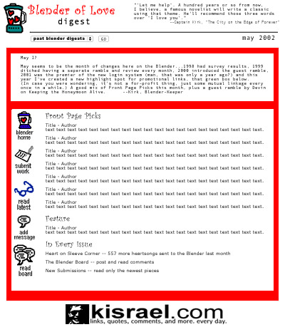
with some modification (mostly shrinking the red line and making it blue, a few other changes) it's what I used to make the HTML.
I also took the opportunity to merge the idea of a site frontpage with the current monthly digest. This mean that every month had to have access to everything on the site. (Also, it let me play down the old Poetry / Prose / Something Else sections...while they were an important part of the site, they're no longer the main focus of what the place is about.)
So that's it. Maybe the new look will last another 5 years! Meanwhile, here are some images from the past:
I don't know what this was for, (probably meant as a repeating background image) but I kind of like the look:

Finally, a title image that once was or might have been:

and I don't know what to say about this one...

...except maybe "Wheeeee!"


